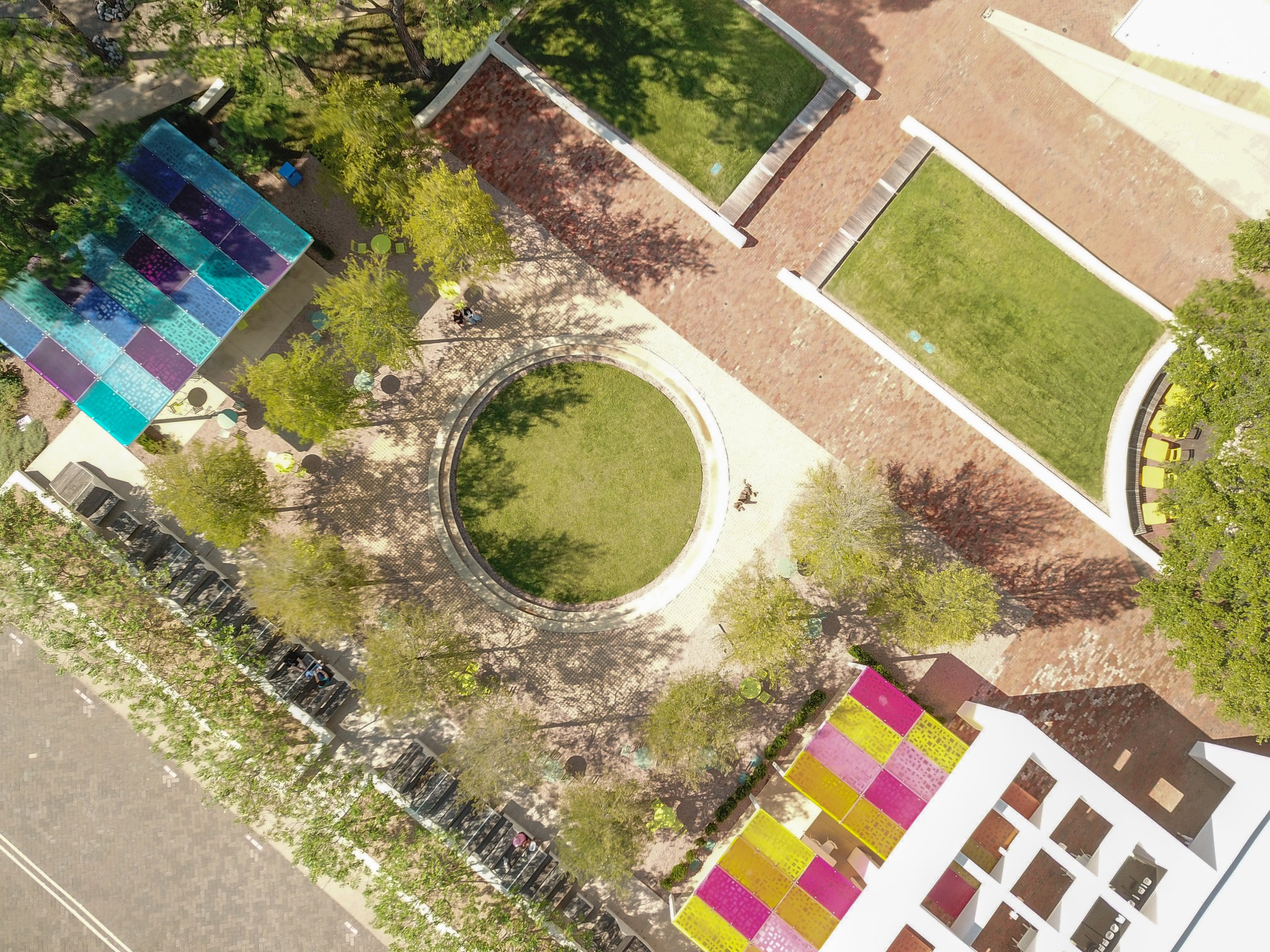
The Plaza at Solana | Westlake, TX
The overall design goal for The Plaza at Solana is to create a centralized sense of place for all who visit the campus, provide welcoming opportunities for adjacent future retail, office and restaurant tenants and to expand the campus programming and events to create a destination for daily visitors as well as for the community.
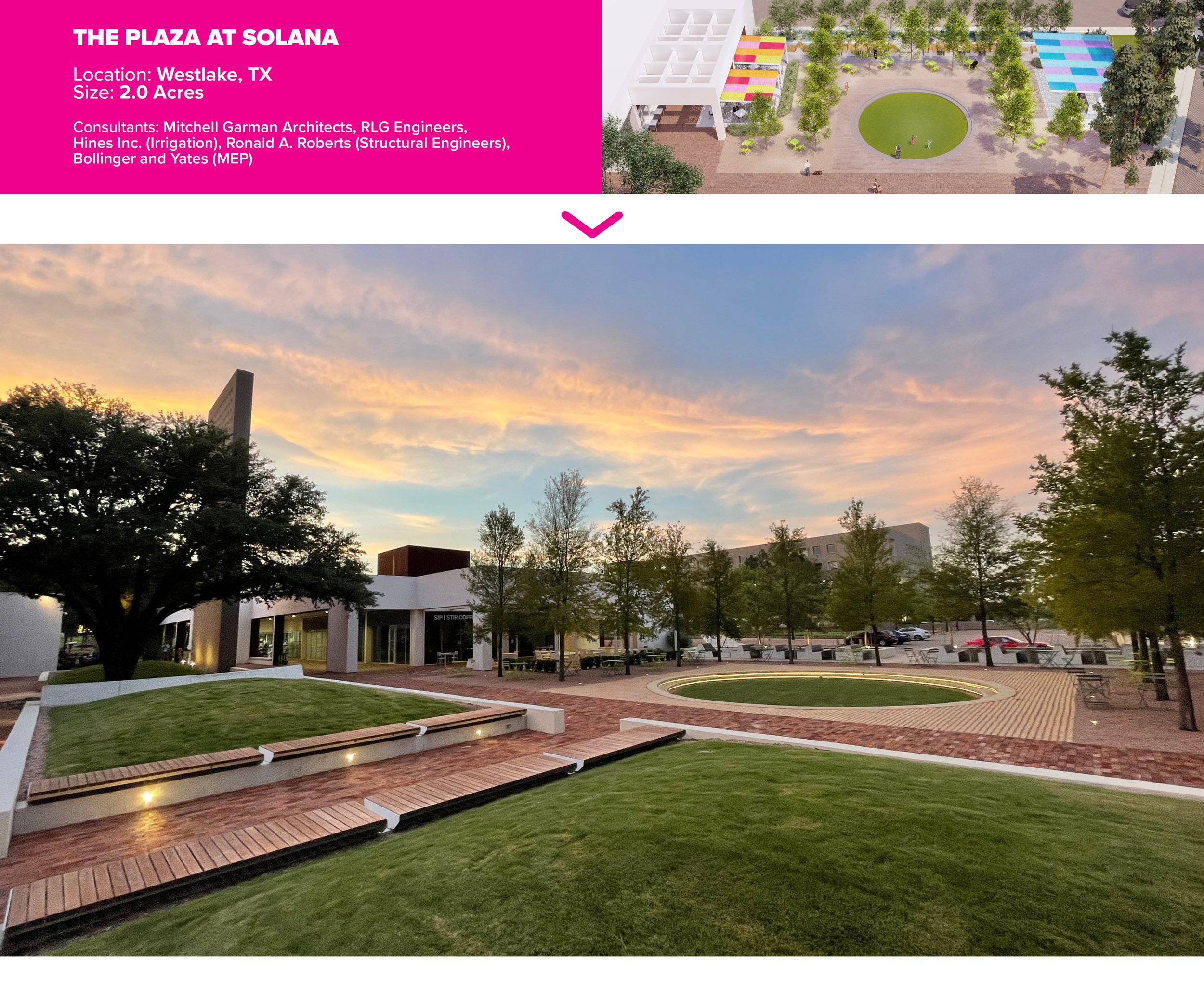
Solana Plaza is a courtyard renovation design located within a larger campus originally designed in 1987 by Ricardo Legorreta and Peter Walker. In order to serve the current multi-tenant uses of Solana Plaza, the proposed design seeks to preserve the memory of Solana Plaza by understanding and reincorporating the concepts and elements of the original design in a way that is sensitive to the existing architectural context. The result is a multi-layered, multi-functional co-working and event plaza that functions for the adjacent tenants as well as the greater community of the Town of Westlake. The landscape architectural team was the prime consultant and worked directly with the owner/developer team to carefully create a meaningful renovation of the outdoor space.
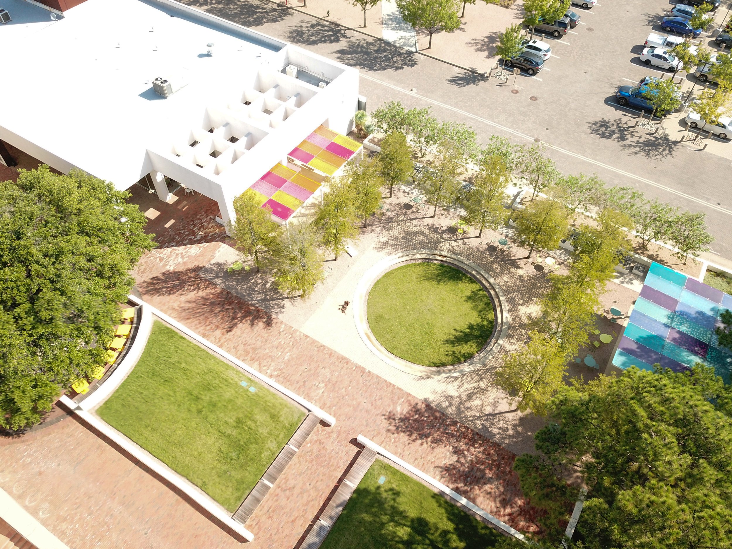
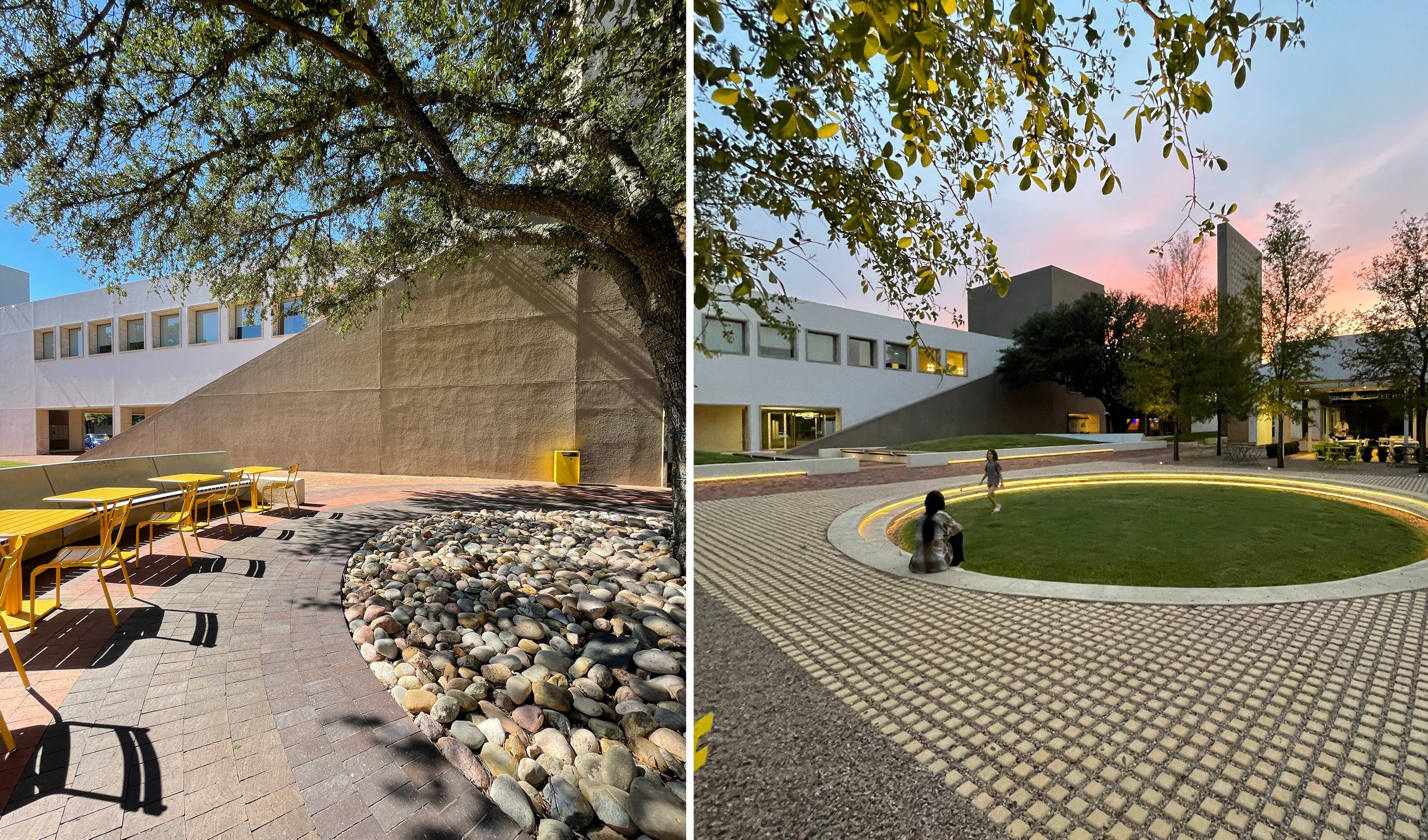
The pavilions at The Plaza at Solana create a transitional element between the buildings and landscape by using a cut metal scrim beneath colored polycarbonate panels to provide protection to patrons, while casting dappled colored light. The colors selected for the panels pay homage to the original color palette of the architecture. The pavilions are intended to be more of an artful folly than an extension of the very heavy and grounded original buildings. The colorful panels provide a sense of “discovered” color and delight as it transfers to surfaces below. Designed in collaboration with Mitchell Garman Architects.
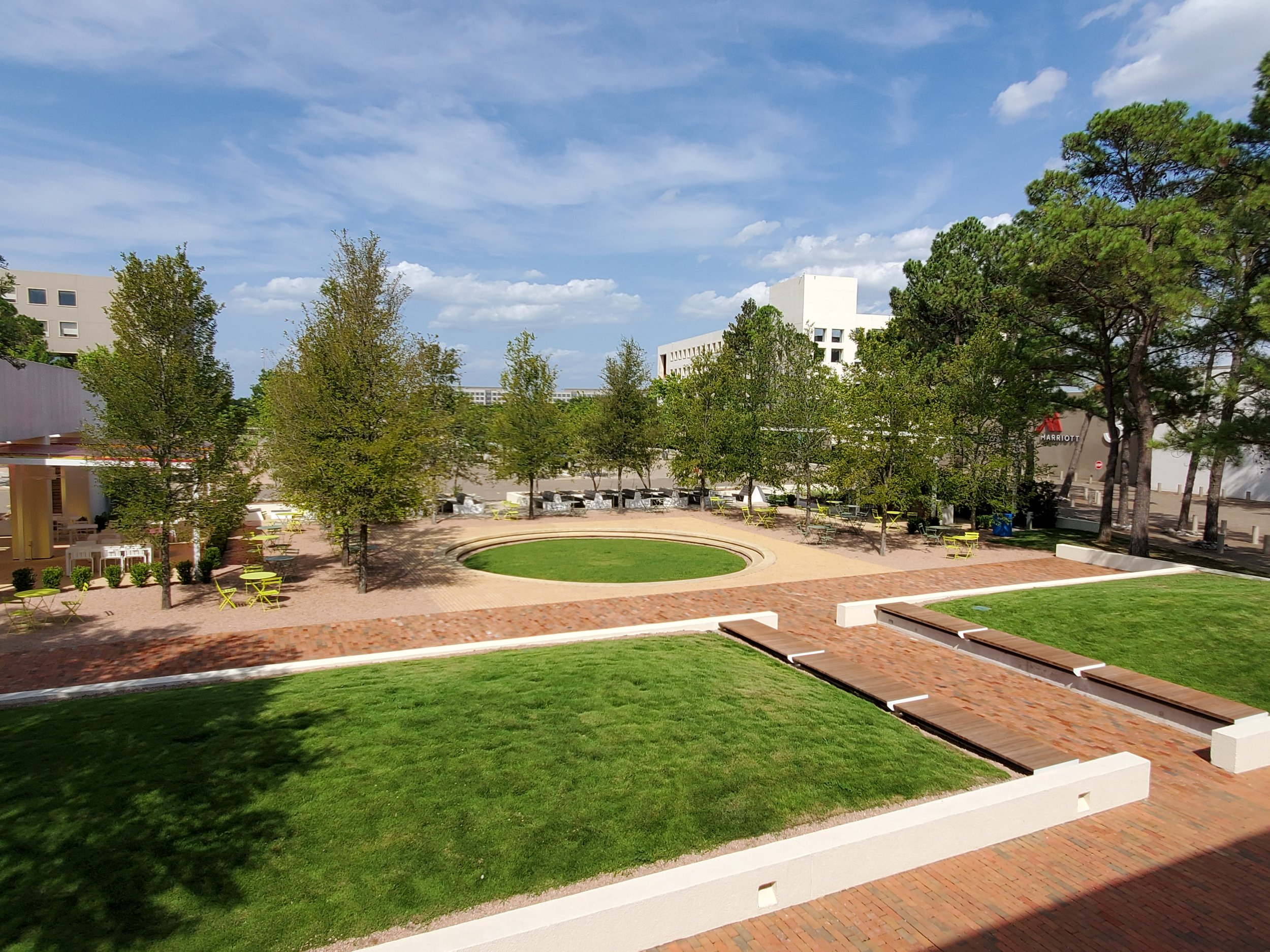

With the building and courtyard design fragmented from the previous revisions, the design team sought to restore the memory of the original Solana Plaza design by using the architectural dimensions of the arcades and columns to extend the cloister edge and re-frame what users understand as the courtyard. The bosque uses the 14’ dimension of the arcade to create a bosque of elms that extends the gridded tree planting from the main mall across Village Circle and frames a circular central lawn that sits within a square field of pavers and gravel. A raised lawn mall helps to both visually unify the interior and expanded courtyard while also physically establishing unique, identifiable spaces.
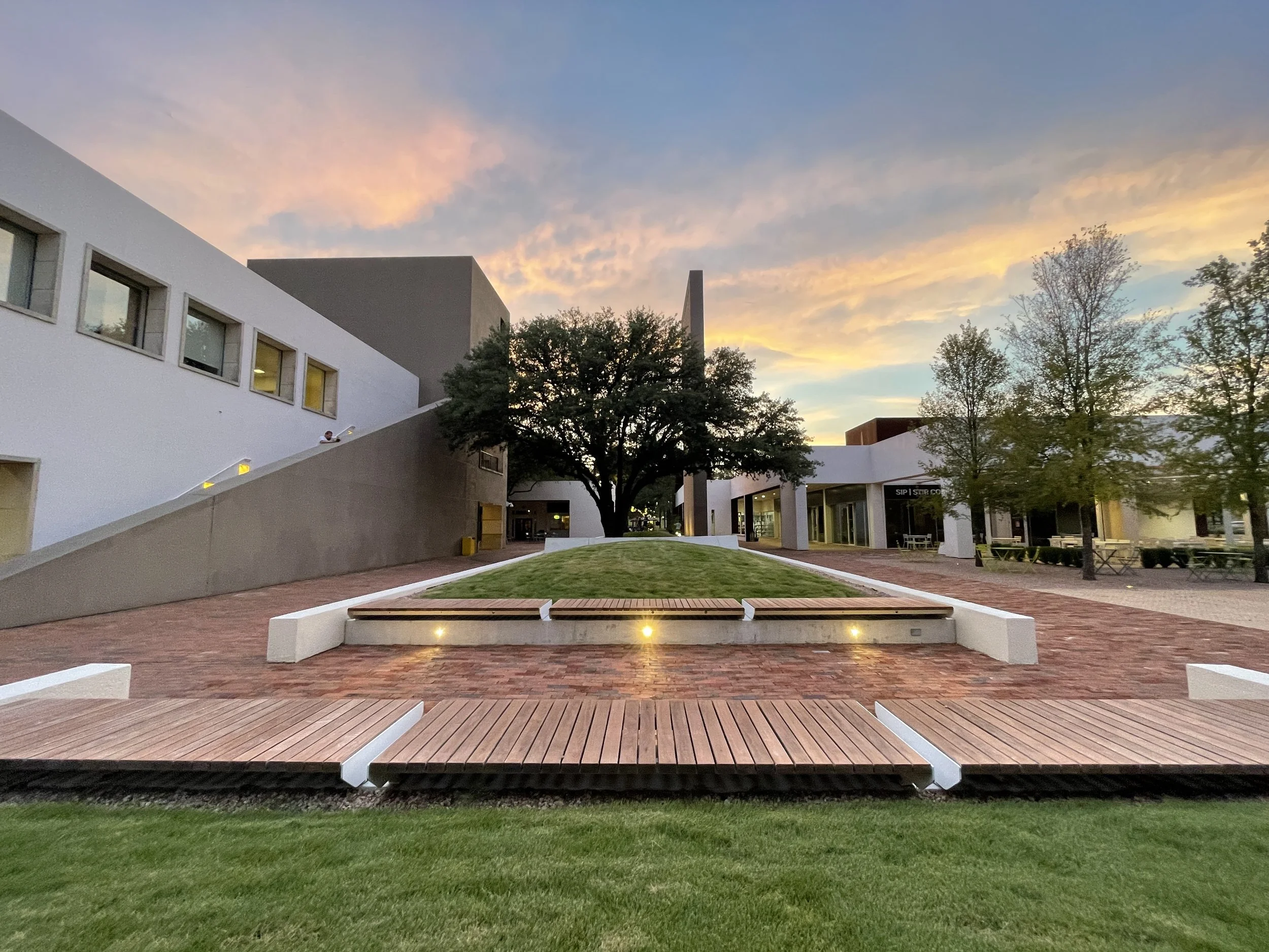

New pavilions reference the original colors and forms of the buildings and help frame the new courtyard. These work with a variety of movable and built-in seating options to provide inviting and engaging outdoor spaces for patrons of the adjacent uses: office, hotel, retail, restaurant and the community alike. These new planting and seating edges help create the new large gathering space with the bosque and pavilions, a smaller circular seating area at one of the large existing oak trees, and a better-defined outdoor dining area adjacent to the existing restaurant spaces.

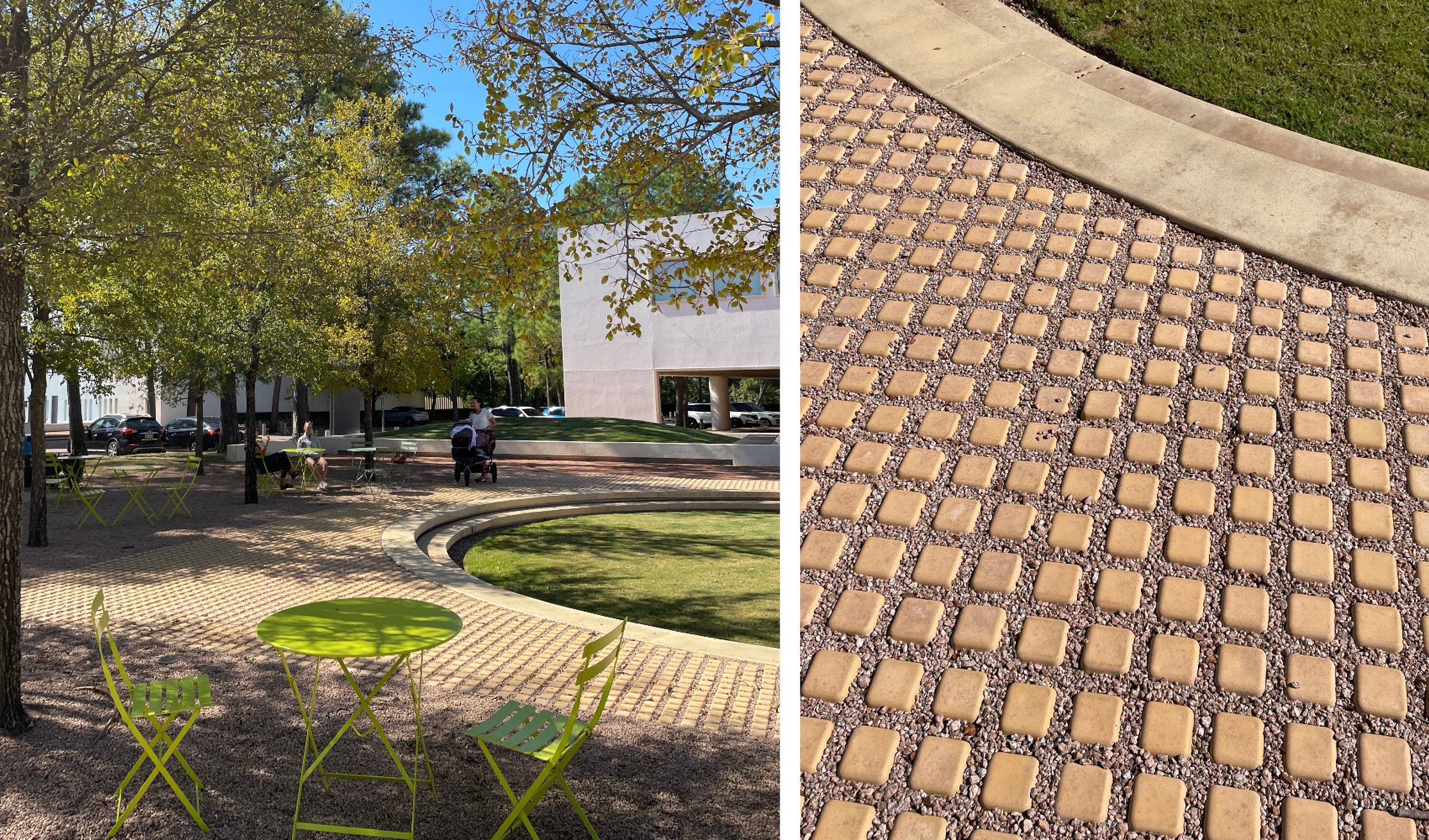
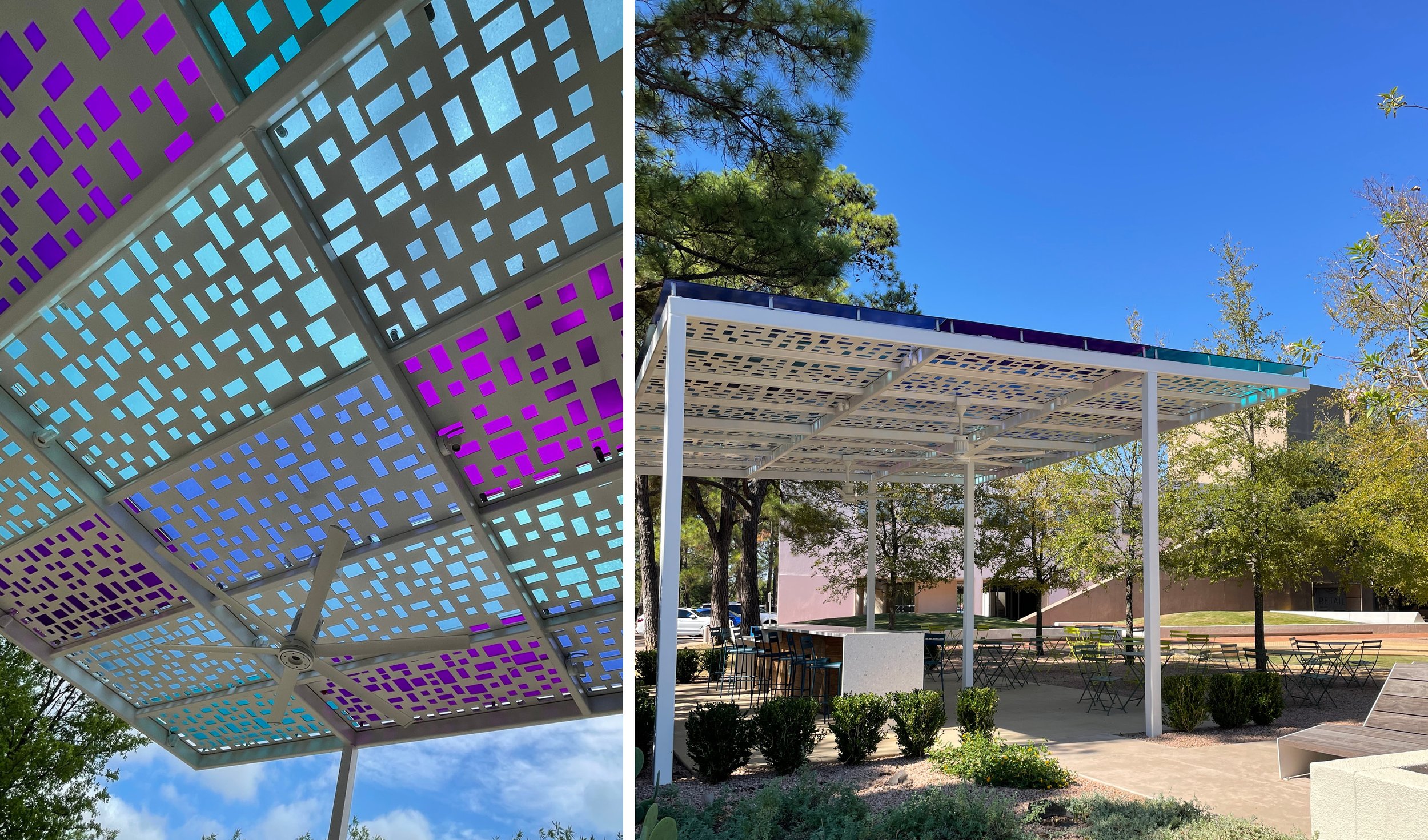
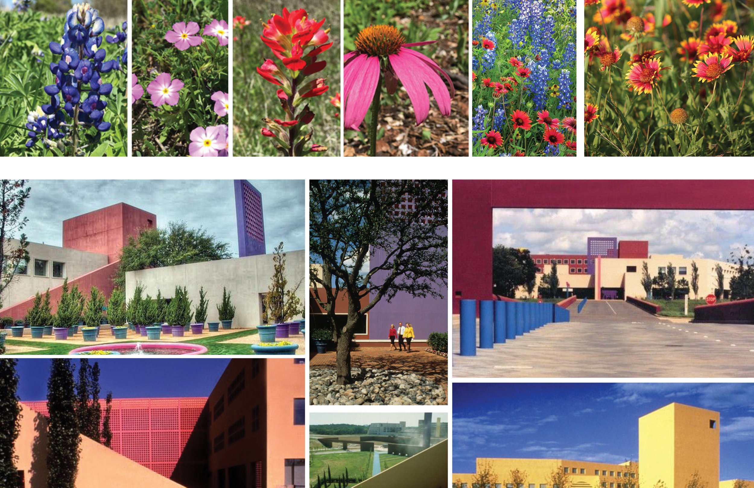
The color palettes were inspired by the North Texas prairie wildflowers, which originally inspired Ricardo Legoretta.
Images Below: Original architecture by Ricardo Legoretta + landscape by Peter Walker and Martha Schwartz circa 1989. The colors of the architecture and design of the landscape was lost in several renovations by 2012. DELINEATOR aimed to recall the “Memory of Place” while addressing the needs of current and future use for the campus.
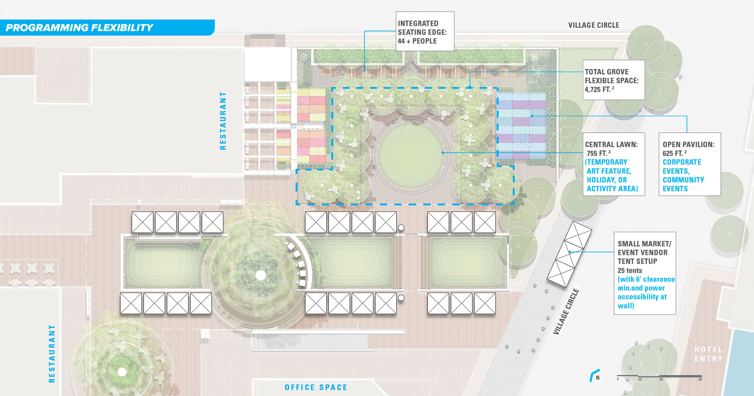
The plaza is meant to comfortably support daily use through the week by the office tenants, hotel visitors and patrons of the new restaurant space. The larger pavilion and integrated seating will be equipped with electrical outlets and wi-fi to provide outdoor co-working space. The durability of the design, however, also allows for larger, community-scaled events such as markets, yoga, holiday tree-lighting, summer concerts and 5-K related activities.

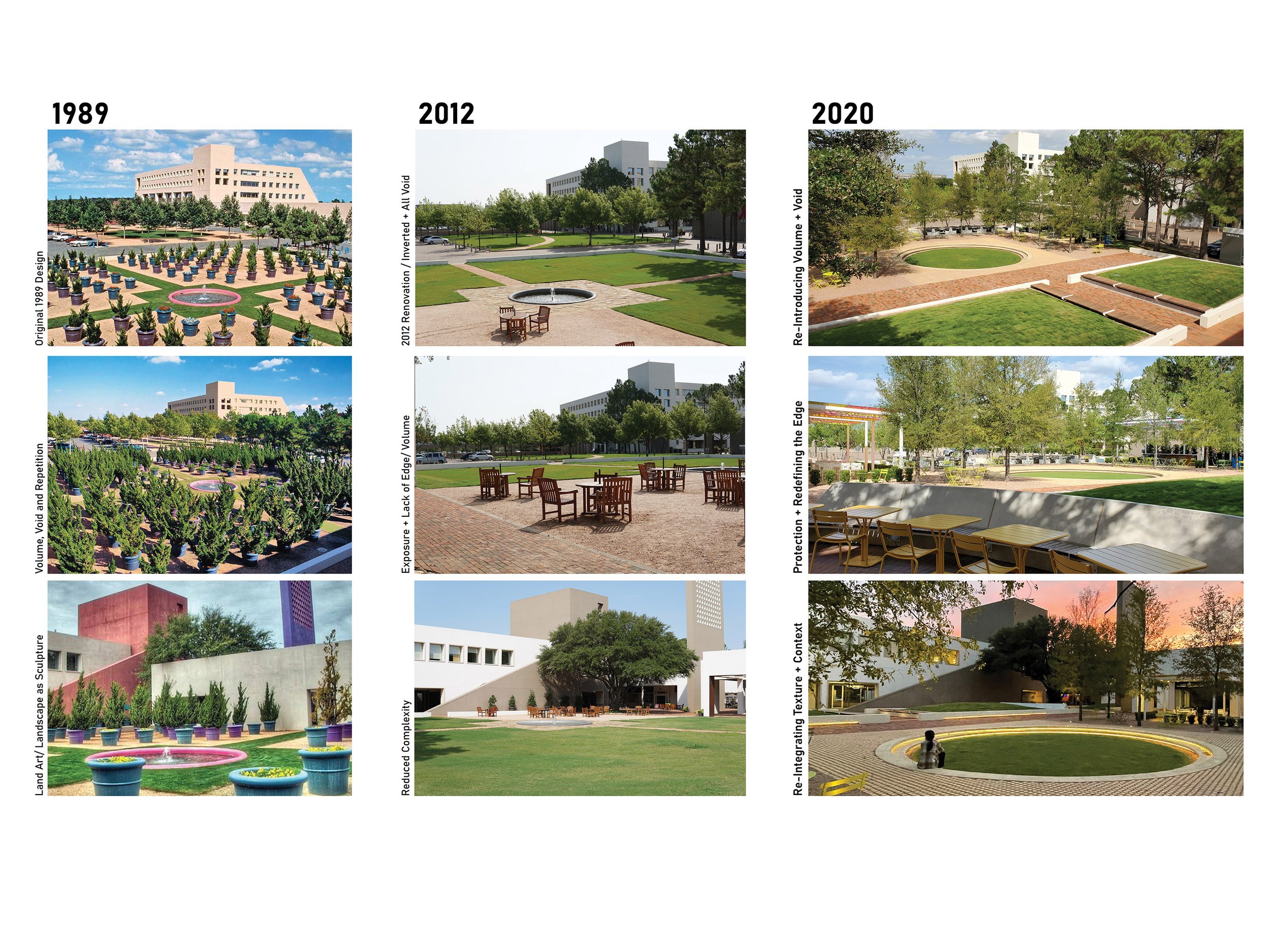
The left column shows the original design of the courtyard space by the Office of Peter Walker and Martha Schwartz. The center column shows the revised architecture and landscape circa 2015. The right column depicts the newly constructed design that references the large forms, colors and textures of the original design while also evolving the space to focus on user experience.
